Problem
Museum information is often scattered, outdated or hard to navigate.
A museum app designed to make discovering exhibitions and booking visits faster, easier, and more intuitive.
A concept mobile experience for people who enjoy museums but not planning them — one clear flow from discovering an exhibition to holding a ticket.

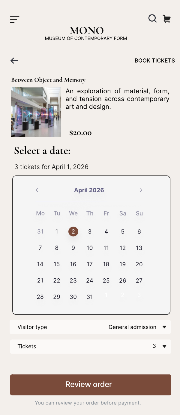
Finding exhibitions, checking hours and booking tickets often takes more effort than the visit itself.
Museum information is often scattered, outdated or hard to navigate.
Design a simple mobile experience that helps users discover exhibitions, explore events, and book visits quickly.
A clearer museum app that reduces friction across discovery, planning, and booking.

“I enjoy going to museums, but I don’t have time to call, search multiple pages, or figure out how to book.”
Design persona: a composite I wrote to keep decisions consistent across screens. The interviews shaped the priorities; this profile is a working tool, not a research finding.
Five short three-question interviews with occasional museum-goers pointed the same way: not motivation, but the effort planning takes.
Method & limits: five people in my own circle, three questions each. A small, informal sample — enough to surface where the friction sits, not to quantify it.
Users struggled to find where to start and did not always recognize the right path to reserve tickets.
Important cultural content was often buried, making discovery feel passive instead of inviting.
Opening hours, schedule details, and booking actions needed to be visible earlier in the flow.
People wanted one place to explore, decide, and book without switching between disconnected pages or channels.
The app structure supports a simple visitor journey: explore, decide, book, and access tickets.
This became the central experience of the product: from interest to confirmed booking in fewer steps.
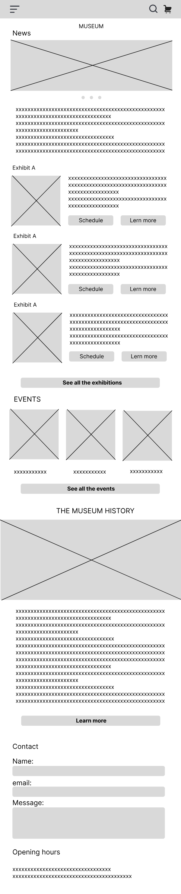
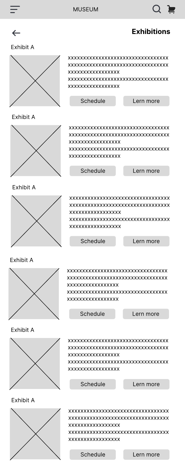
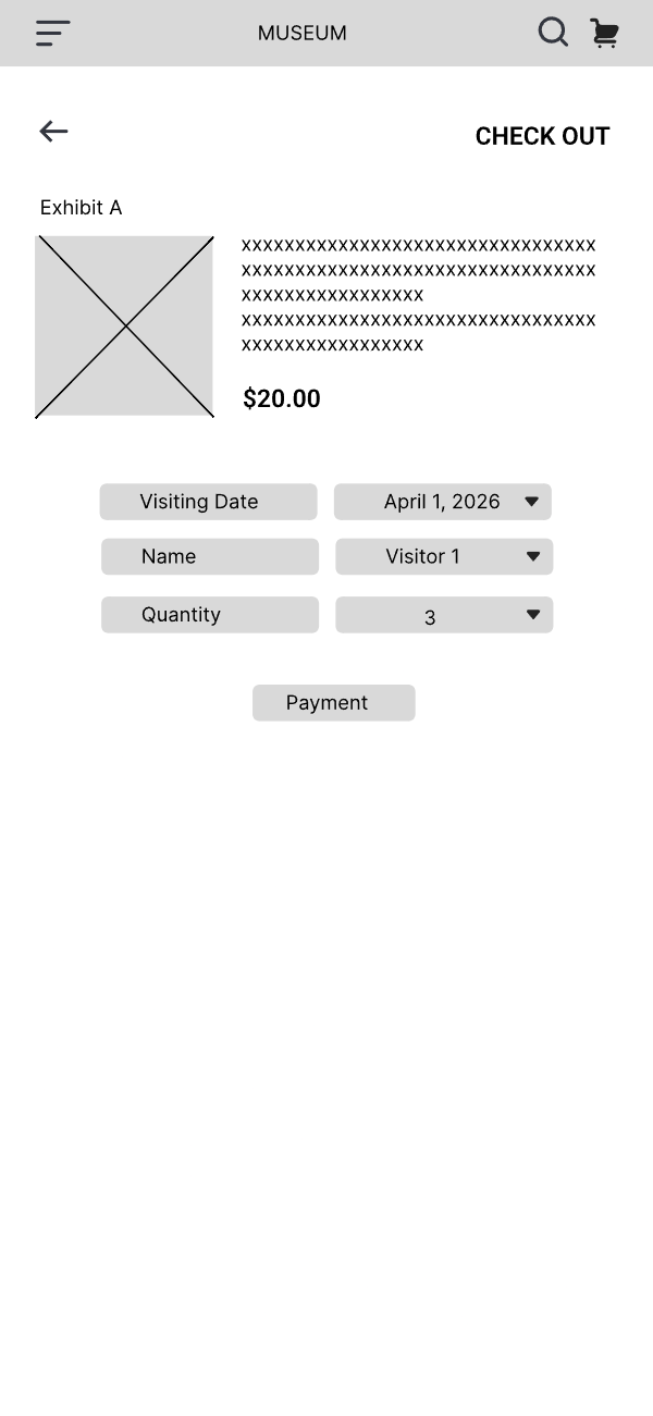
The wireframes were where I argued with myself about navigation labels and how early the booking action should appear. Only what survived that got a visual pass.
Iteration aimed at easier discovery and more direct booking, especially for users with limited time.
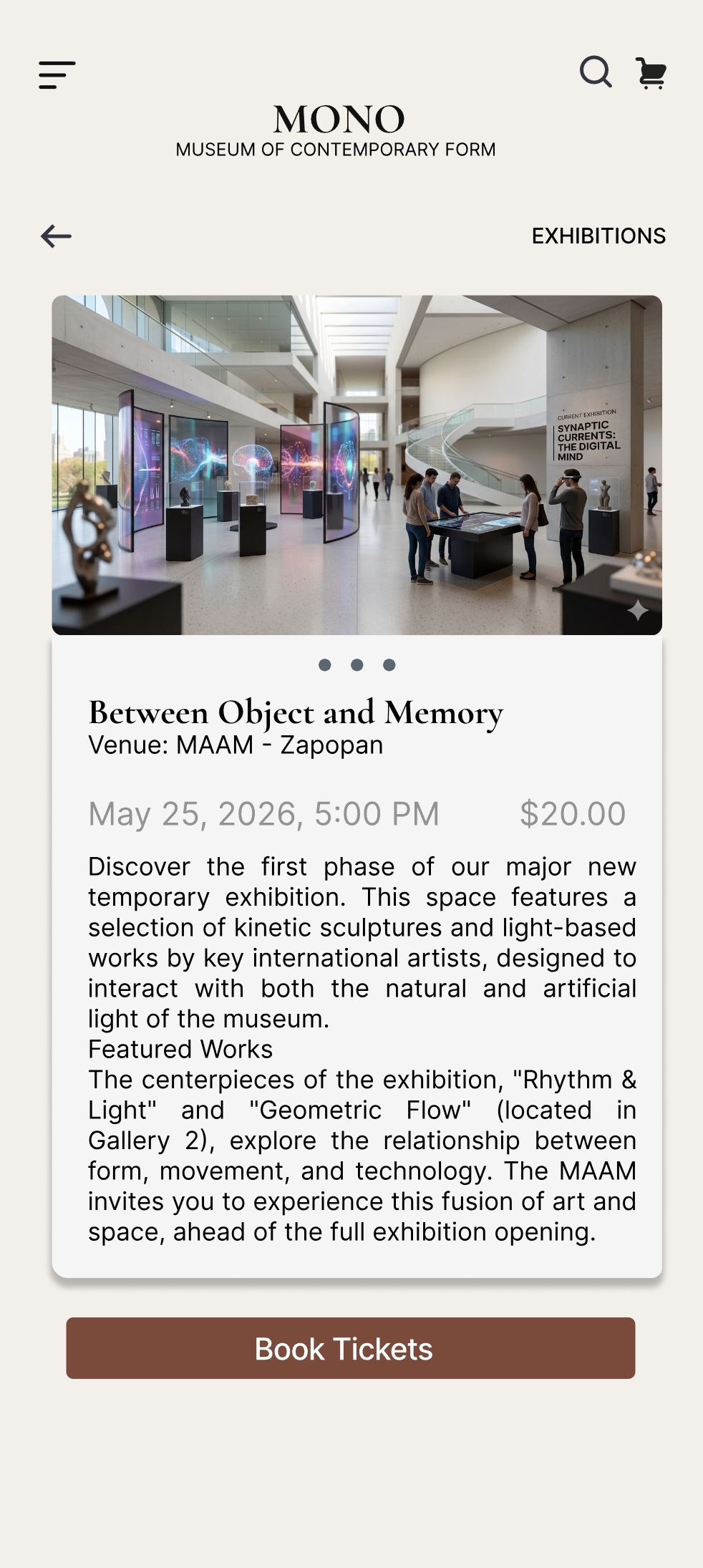
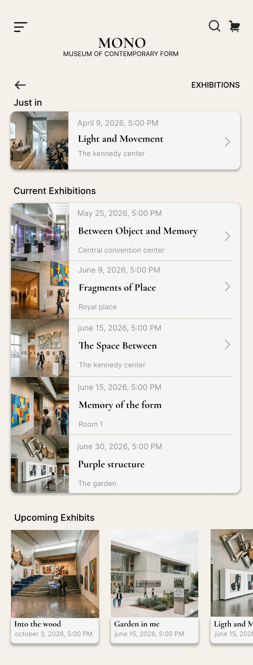
The final concept brings exhibitions, events, booking and ticket access into one mobile flow.
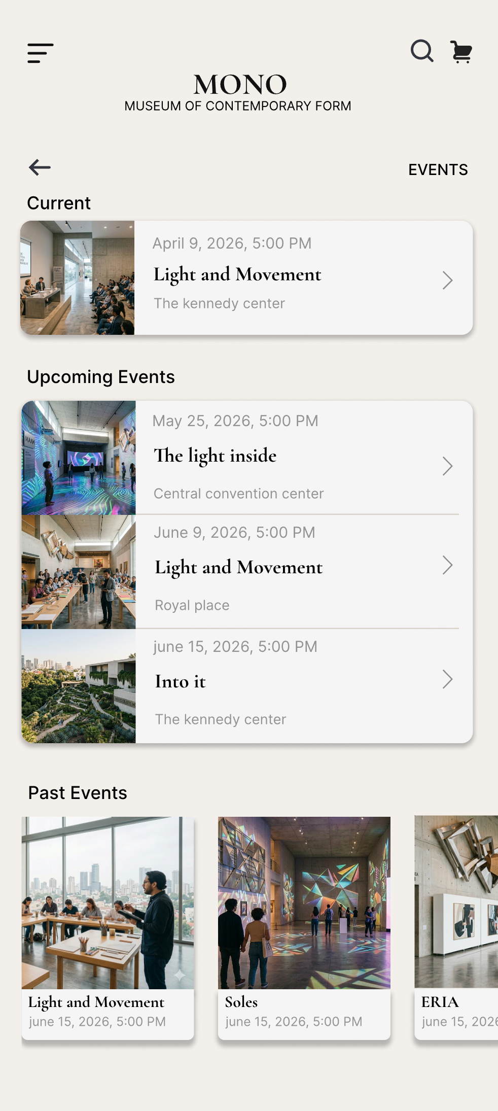
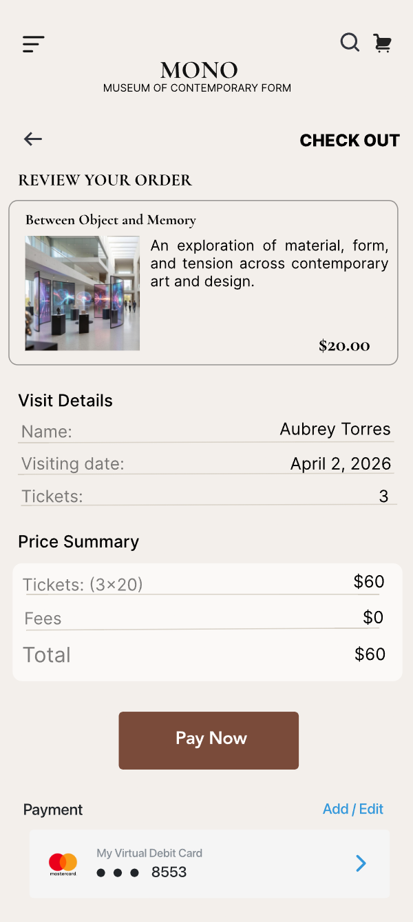
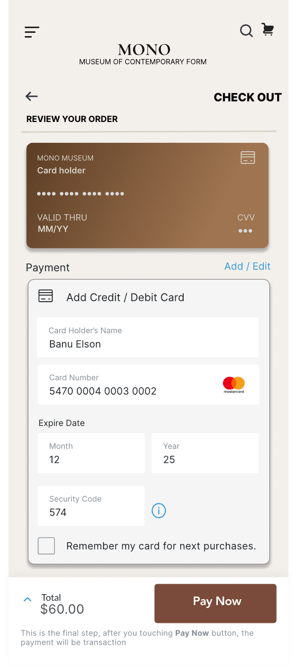
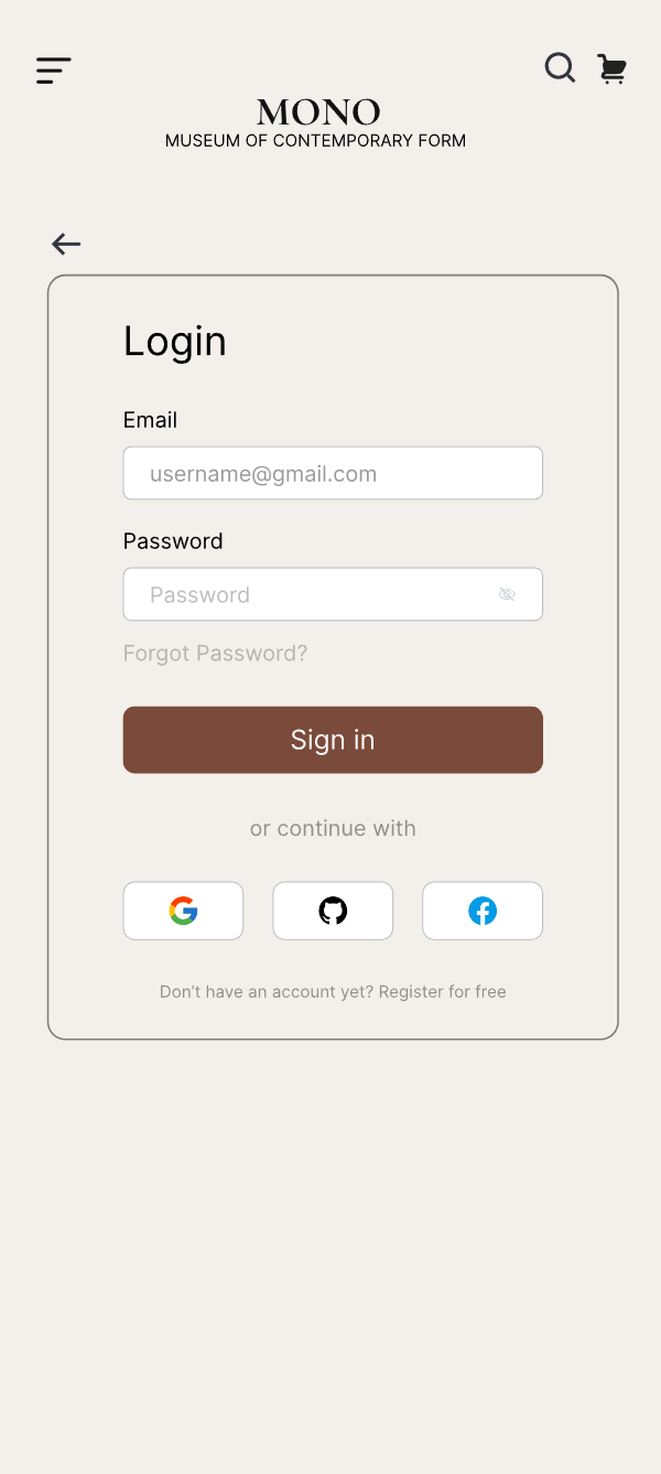
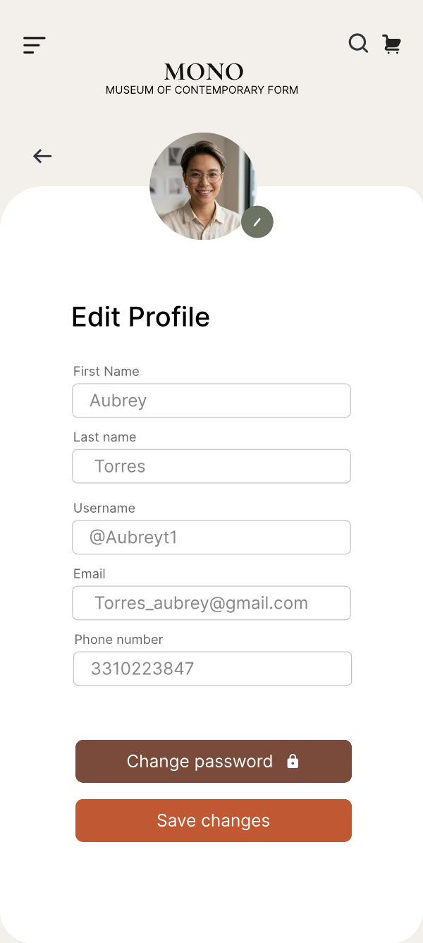
Users browse exhibitions and events through stronger content hierarchy and cleaner category separation.
Ticket purchase is surfaced earlier, with a shorter path from content to checkout.
Hours, details, availability, and tickets are centralized to reduce effort and uncertainty.
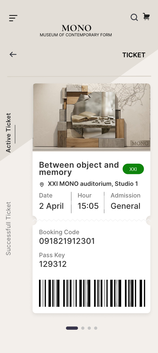
After the first booking, the next visit starts from what the visitor already has: their tickets, the hours and what’s coming next.
Each one spends screen space or a tap to remove a moment of doubt.
Every exhibition and event detail carries a direct path to tickets — users never hunt for a separate booking section.
Trade-off — repeated actions spend screen space on content pages.
Two distinct sections instead of one mixed feed, so each can be scanned with its own logic.
Trade-off — one more top-level destination to learn and maintain.
Dates, times and pricing appear on the detail screen — before anyone commits to paying.
Trade-off — longer detail pages that demand stronger hierarchy.
Once a visit is booked, the active ticket surfaces first — the app’s job shifts from selling to serving.
Trade-off — discovery content gives up the prime slot on visit days.
Most of what I learned here was about sequence — which piece of information has to arrive before someone will commit.
Even motivated users abandon experiences when planning feels inconvenient.
Surfacing the right information at the right time made the app feel more intuitive and trustworthy.
For cultural products, discovery depends as much on structure and clarity as it does on visuals.
Reducing steps and clarifying actions made the experience feel more useful and more inviting.